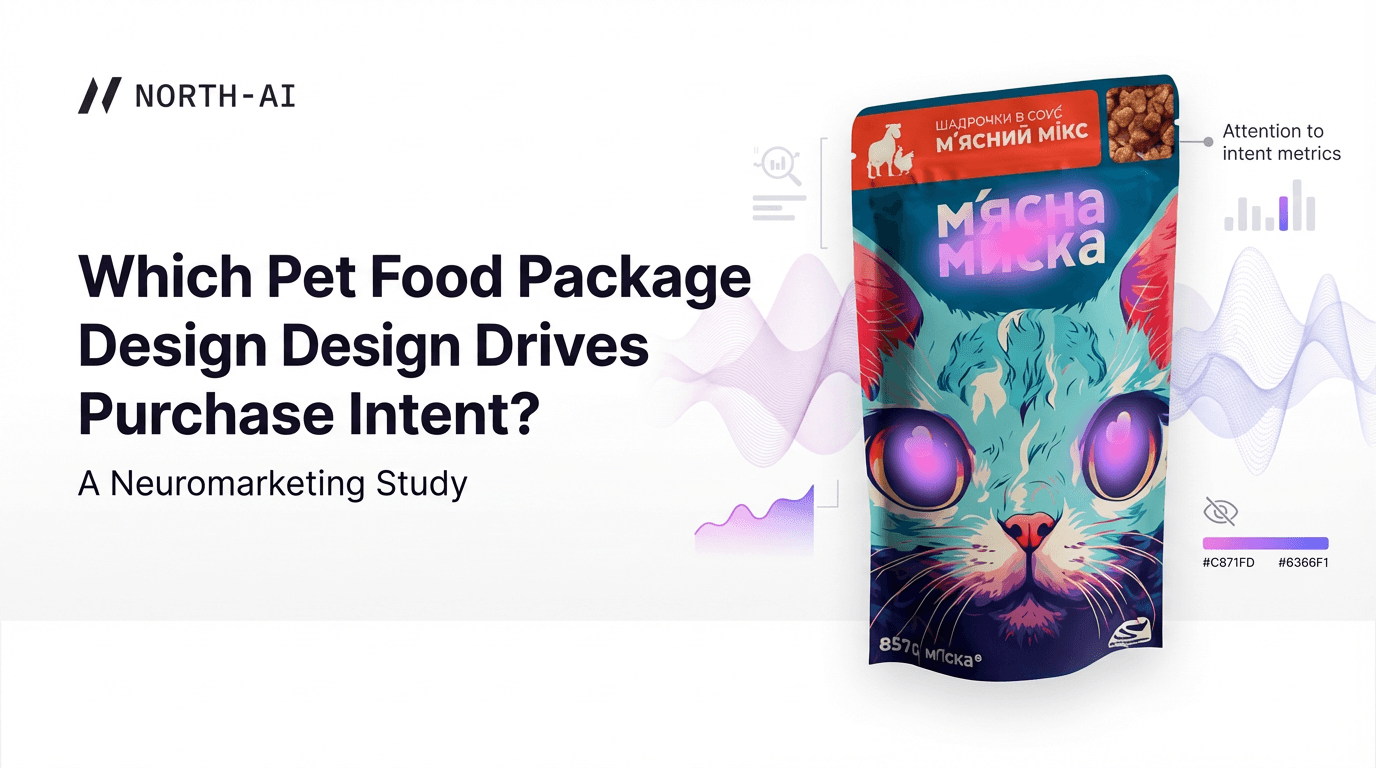
Which Pet Food Package Design Drives Purchase Intent? A Neuromarketing Study
Neuroscience
Package Design
NORTH AI · Case Study · Neuroscience Research · north-ai.com
— CASE STUDY: VIDEO ENGAGEMENT MEASUREMENT
Measuring Audience Engagement in Video Content Using Eye-Tracking Data
A neuroscientific study conducted by North AI. 301 participants across the US and Canada were eye-tracked while watching 6 promotional videos. Gaze synchronisation and spatial entropy data revealed which moments engage audiences — and which don't.
Category: Neuroscience · Video Engagement · 301 respondents
301
| 6
| 3
| 30%
| 2
|
Background
North AI measures how audiences cognitively respond to video content — second by second. This study, by North AI, a neuroscience and AI R&D company, was designed to validate and develop the eye-tracking methodology that underpins North AI's engagement measurement platform.
The central question: can eye-tracking data from remote participants, collected at scale, reliably capture audience engagement in promotional video content? And if so, which specific metrics carry the most predictive signal?
Six promotional videos were tested — three horizontal (~30 seconds each) and three vertical (~15 seconds each) — spanning different brands, categories, view counts, and expert-rated quality scores. Respondents were recruited across the US and Canada and tracked via webcam-based eye-tracking software.
Dataset
RESPONDENT DEMOGRAPHICS
301 respondents completed the study. Mean age was 36.6 (±9.9), with a median of 35. 245 were US residents and 56 were Canadian. The sample was 155 female and 146 male, with a mix of ethnic backgrounds.
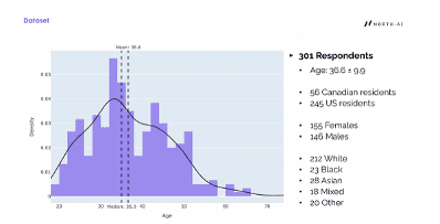
Fig. 1 — Age distribution of the 301 respondents. Mean age 36.6, median 35. Participants ranged from approximately 18 to 72 years old.
VIDEOS TESTED
Six promotional videos were selected to represent a range of engagement performance, as measured by real-world YouTube metrics (views, likes, reposts, comments) and two expert scoring dimensions: Brand Hero Rating and Category Entry Point Relevance.
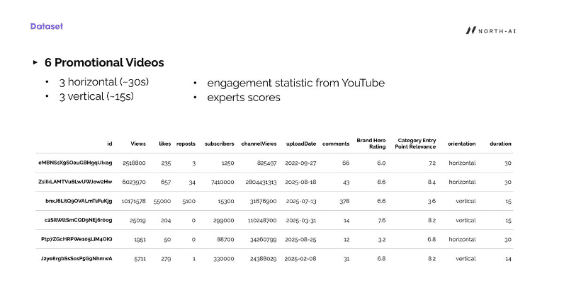
Fig. 2 — Dataset of 6 promotional videos with YouTube engagement metrics and expert scores. Videos range from 1,951 views to over 10 million views, covering both horizontal (30s) and vertical (15s) formats.
Full video dataset:
|
|
|
|
|
|
|
|
|
|
eMBNSsX9… | 2,518,800 | 235 | 3 | 1,250 | 825,497 | 2022-09 | 66 | 6.0 | 7.2 |
ZsiIkLAMT… | 6,023,970 | 657 | 34 | 7,410,000 | 2,804,431,313 | 2025-08 | 43 | 8.6 | 8.4 |
bnxJ6LitQ… | 10,171,578 | 55,000 | 5,100 | 15,300 | 31,676,900 | 2025-07 | 378 | 6.6 | 3.6 |
c2SIlWltS… | 25,019 | 204 | 0 | 299,000 | 110,248,700 | 2025-03 | 14 | 7.6 | 8.2 |
Ptp7ZGcH… | 1,951 | 50 | 0 | 88,700 | 34,260,799 | 2025-08 | 12 | 3.2 | 6.8 |
J2ye8rgb… | 5,711 | 279 | 1 | 330,000 | 24,388,029 | 2025-02 | 31 | 6.8 | 8.2 |
Methodology
DATA COLLECTION PROTOCOL
Participants were asked to watch all six videos while webcam-based eye-tracking software recorded their gaze position at each moment. A calibration step was completed before testing began.
During initial testing, the research team identified a data quality problem. Participants appeared to complete the eye-tracking tasks carelessly — motivated primarily by the end-of-study reward rather than genuine attention. This introduced noise into the gaze data, particularly for content gaze vs screen gaze ratios.
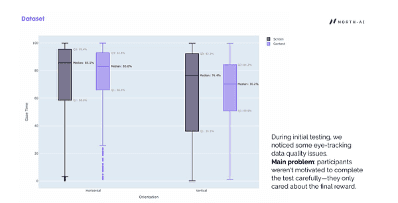
Fig. 3 — Initial gaze time distribution for horizontal and vertical videos (screen vs content gaze). Wide variance in content gaze (Q1: 66%, Q3: 92.8% for horizontal; Q1: 50.9%, Q3: 84.2% for vertical) indicated inconsistent participant engagement during data collection.
UX IMPROVEMENTS TO IMPROVE DATA QUALITY
Three protocol changes were implemented to improve data reliability:
Shortened calibration step — reduced upfront friction that may have discouraged careful completion.
Added detailed text instructions — participants received explicit written guidance on correct positioning and behaviour before testing began.
Restricted head movement — participants were required to acknowledge a warning about maintaining consistent head and device position throughout the study. Movement invalidates webcam-based gaze tracking.
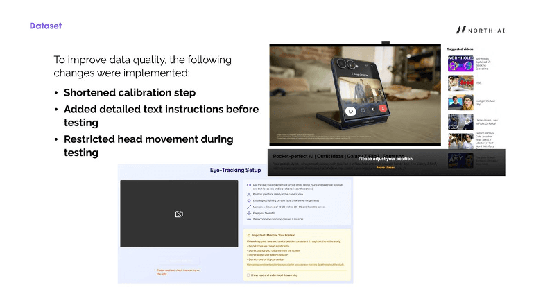
Fig. 4 — Revised eye-tracking setup interface showing detailed positioning instructions and mandatory position acknowledgement. These changes substantially improved data quality in the final dataset.
SECOND VIEWING CONDITION
30% of respondents (approximately 90 participants) were randomly selected to re-watch one horizontal and one vertical video after completing the main task. These second viewings played without sound and were randomly assigned.
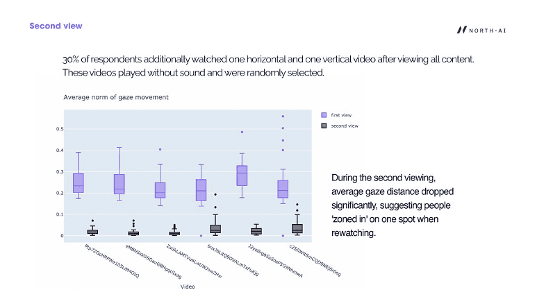
Fig. 5 — Average norm of gaze movement: first view (purple) vs second view (dark). On second viewing, average gaze distance dropped sharply across all six videos — indicating viewers fixated on a single point rather than scanning the content. This confirms that first-view data is distinct and reflects genuine exploratory viewing behaviour.
"On second viewing, average gaze distance dropped significantly, suggesting people 'zoned in' on one spot when rewatching. First-view gaze data is therefore the reliable signal for engagement measurement."
Finding 1: Demographics Affect Blink Synchronisation, Not Gaze Patterns
The first research question was whether demographic characteristics — age, sex, country of residence — affect how people watch video content. The analysis split this question into two parts: does demographic group affect gaze patterns, and does it affect blink synchronisation?
GAZE PATTERNS: NO SIGNIFICANT DEMOGRAPHIC EFFECT
For the "average difference between user gazes" metric, no demographic group showed statistically significant differences across any of the six videos. Gaze patterns — where on screen people look and how they track content — were consistent across age groups, sexes, and countries.
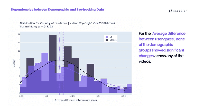
Fig. 6 — Distribution of average gaze difference between US and Canadian respondents for one video (Mann-Whitney p=0.8792). The near-identical distributions confirm that country of residence does not affect where or how participants look at video content.
BLINK SYNCHRONISATION: STATISTICALLY SIGNIFICANT BY SEX AND AGE
Blink synchronisation — the degree to which participants' blinks align in time — showed significant demographic differences. This metric is a proxy for shared emotional or cognitive reaction: when people blink together, they are responding to the same stimulus at the same moment.
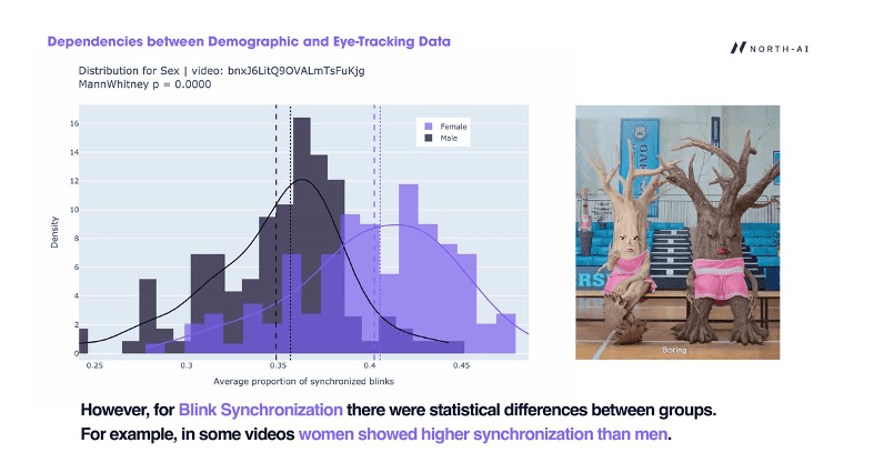
Fig. 7 — Blink synchronisation distribution by sex for one video (Mann-Whitney p=0.0000). Female respondents showed substantially higher synchronisation (median ~0.40) than male respondents (median ~0.35). This pattern appeared in multiple videos.
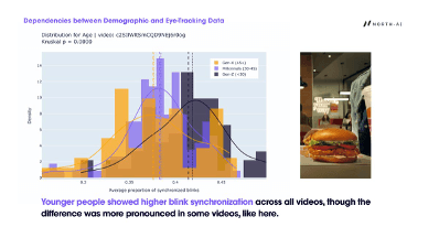
Fig. 8 — Blink synchronisation distribution by age group for one video (Kruskal p=0.0000). Gen-Z (<30) showed notably higher synchronisation than Millennials (30-45) or Gen-X (45+). Younger audiences respond more reactively to video stimuli, particularly advertising and socially relevant content.
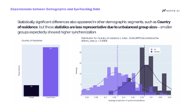
Fig. 9 — Country of residence comparison for blink synchronisation in one video (Welch's t-test p=0.0000). Canadian respondents showed higher synchronisation, but this result is less reliable due to substantially unequal group sizes (56 Canada vs 245 US). Smaller groups tend to show higher synchronisation as an artefact of group size.
Key finding: Gaze patterns are demographic-invariant — video content directs attention consistently regardless of who is watching. Blink synchronisation varies by age and sex, making demographic composition a relevant factor when interpreting synchronisation scores.
Finding 2: Gaze Synchronisation Identifies Moments of High and Low Engagement
Gaze synchronisation measures how similarly different viewers are looking at the same point on screen at the same moment. When gaze is synchronised, all viewers are attending to the same thing. When it disperses, viewers are looking at different elements — indicating competing stimuli, visual overload, or low content direction.
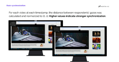
Fig. 10 — Gaze synchronisation visualised across two screens watching the same content. The diagonal dotted line connects the two gaze points — shorter distance = higher synchronisation. When both viewers fixate the same element, the line disappears.
MEASURING SYNCHRONISATION ACROSS THE VIDEO TIMELINE
Average gaze synchronisation across the full video provides a single engagement score per video, but masks important variation within the content. The research team calculated synchronisation at each timestamp across the video runtime to identify specific moments of high and low engagement.
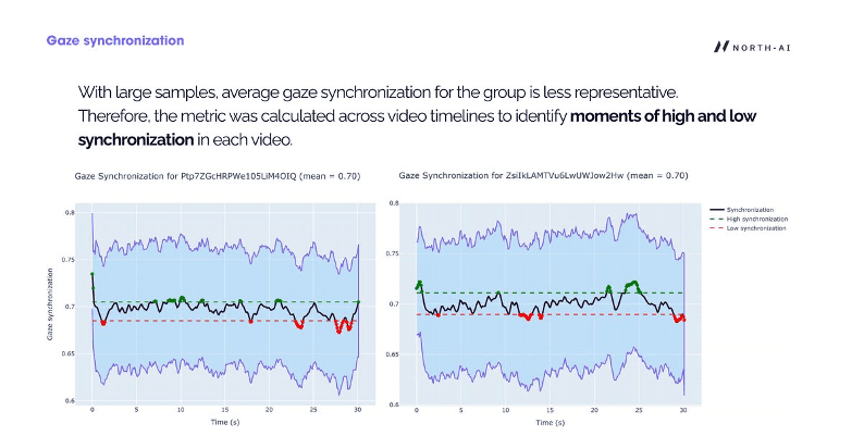
Fig. 11 — Gaze synchronisation over time for two horizontal videos (mean = 0.70 for both). Green dots mark moments of high synchronisation (above threshold). Red dots mark low synchronisation. The timeline reveals specific content moments — often brand reveals or key visual transitions — where viewer attention aligns or diverges.
WHAT CAUSES LOW SYNCHRONISATION
Low synchronisation was consistently associated with three content conditions:
Multiple equally prominent visual objects in frame competing for attention
Fast movement or rapid scene changes
Motion objects in the background during brand/product name display — causing attention to split between the brand element and the moving background
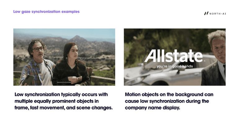
Fig. 12 — Low gaze synchronisation examples. Left: multiple people in frame with similarly weighted visual prominence. Right: moving background elements during brand name display (Allstate) pull attention away from the brand identifier. Both scenarios scatter gaze across the frame.
WHAT CAUSES HIGH SYNCHRONISATION
High synchronisation occurred when visual movement was predictable, linear, and focused. Content with a clear singular moving element — a product, a character in motion, a single focal point — produced the strongest gaze alignment across all viewers.
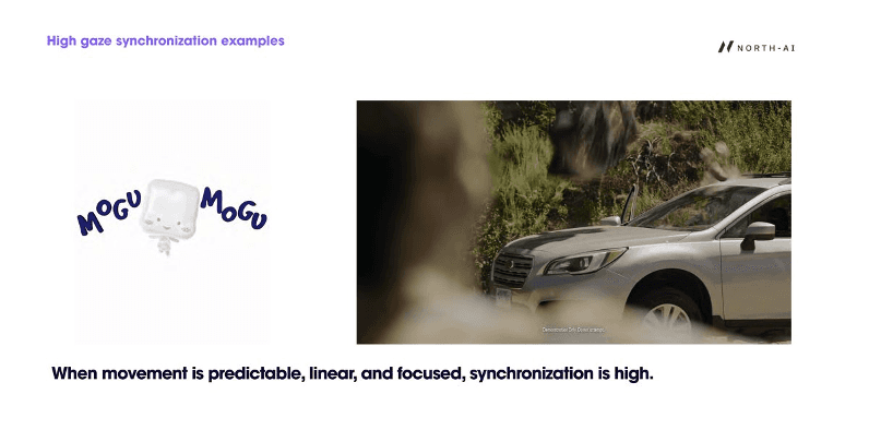
Fig. 13 — High gaze synchronisation examples. A single focal point with directional movement guides all viewers to the same area of the frame. Brand or product elements displayed against clean, uncluttered backgrounds consistently produced higher synchronisation scores.
Finding 3: Gaze Entropy on the Pack Shot Predicts Real-World Engagement
Spatial entropy is a complementary measure to gaze synchronisation. While synchronisation measures agreement between viewers, entropy measures the concentration or dispersal of attention at each moment — regardless of where different viewers are looking.
Low entropy = viewers' gazes are clustered in the same region (strong consensus). High entropy = gazes are scattered across multiple regions (exploration or uncertainty).
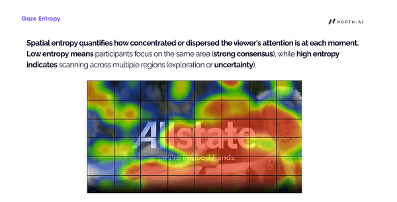
Fig. 14 — Gaze entropy visualised as a grid overlay on a frame from an Allstate ad. Each grid cell shows the local entropy of viewer attention. Central cells (brand name area) show high entropy — viewers' gazes are scattered — despite the brand being prominently placed. This indicates the background motion is fragmenting attention during the brand reveal.
ENTROPY ACROSS THE VIDEO TIMELINE
Like synchronisation, entropy was calculated at each timestamp to identify specific moments where viewer attention was focused vs dispersed. The two metrics are complementary — they often identify the same problem moments but can diverge in certain content conditions.
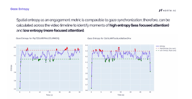
Fig. 15 — Gaze entropy over time for two 30-second videos. Red dots mark high entropy moments (dispersed attention). Green dots mark low entropy (focused attention). The pattern shows that both videos alternate between periods of focus and dispersal, with the opening seconds typically showing very high variance before viewers orient to the content.
LOW ENTROPY EXAMPLES
Entropy is low when the primary visual element and associated text or brand identifier are positioned close together in the frame. This creates a compact attention zone — viewers do not need to scan across the screen to process both the product and its label simultaneously.
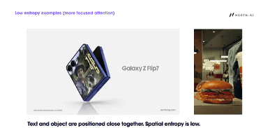
Fig. 16 — Low entropy examples. Samsung Galaxy Z Flip7 ad: product and brand name positioned in adjacent frame zones. Burger King ad: product image and brand identifier in close proximity. In both cases, attention is concentrated in a small area, producing low entropy scores.
HIGH ENTROPY EXAMPLES
Entropy rises when caption and object are spatially separated in the frame. Viewers scan between the product or scene element and the text overlay, increasing the spatial spread of gaze across the frame.
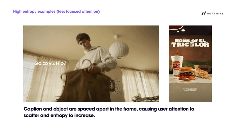
Fig. 17 — High entropy examples. Galaxy Z Flip7 ad (lifestyle version): brand name positioned in lower left while the human subject occupies the centre — viewers split attention between the two. Burger King poster: text and product separated vertically, causing scanning behaviour that increases entropy.
ENTROPY ON THE PACK SHOT PREDICTS REAL-WORLD PERFORMANCE
Full-video entropy statistics showed no significant relationship to YouTube performance metrics. The signal only became clear when the analysis focused on the final 2 seconds of each video — the pack shot or brand/product name end tag.
This segment is where the video delivers its commercial payload: the brand reveal, product display, or call to action. Viewer attention at this specific moment is what determines whether the video achieves its purpose.
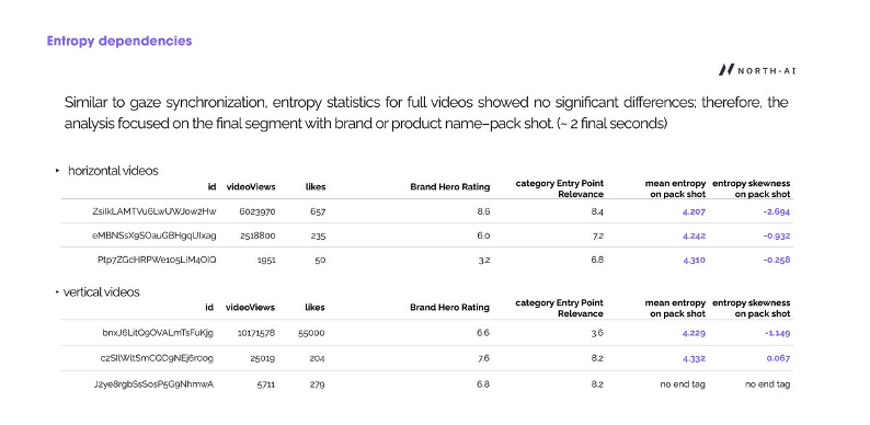
Fig. 18 — Entropy statistics on the pack shot for all 6 videos. For horizontal videos, the highest-performing video (ZsiIkLAMTVu6, 6M views) had the lowest mean entropy (4.207) and the most negative skewness (−2.694) on the pack shot. The lowest-performing video had higher entropy and less negative skewness. The same pattern holds for vertical videos.
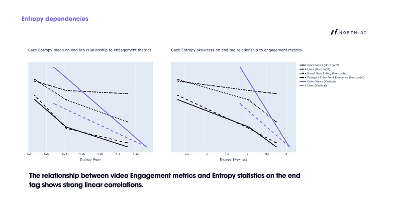
Fig. 19 — Linear correlations between gaze entropy statistics on the pack shot and real-world YouTube engagement metrics (views, likes, Brand Hero Rating, Category Entry Point Relevance). Both entropy mean and entropy skewness show strong linear relationships with all engagement metrics across horizontal and vertical formats.
"The relationship between video engagement metrics and entropy statistics on the end tag shows strong linear correlations. Lower entropy on the pack shot — more focused attention on the brand at the critical closing moment — predicts higher views, likes, and expert ratings."
Summary of Findings
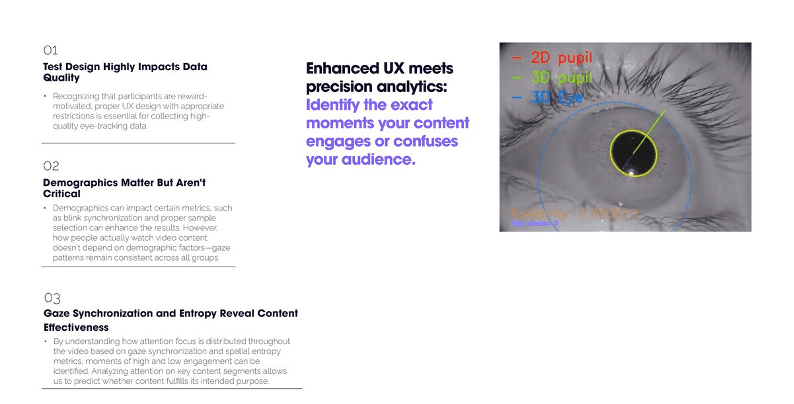
Fig. 20 — Three key conclusions from the study: test design impacts data quality; demographics matter but aren't critical; gaze synchronisation and entropy reveal content effectiveness.
The study produced three clear conclusions:
01 — Test design critically affects data quality. Remote, reward-motivated participants produce inconsistent eye-tracking data without proper UX controls. Shortened calibration, explicit instructions, and head movement restrictions substantially improved signal quality. This finding has direct implications for how remote eye-tracking studies should be designed at scale.
02 — Demographics affect blink synchronisation but not gaze patterns. Where people look and how they track video content is consistent across age, sex, and country. This means engagement measurement from eye-tracking is broadly generalisable. However, blink synchronisation — a measure of shared emotional reaction — does vary by demographic group, particularly by age. Younger audiences show higher synchronisation, indicating greater neural reactivity to advertising and socially relevant content.
03 — Gaze entropy on the pack shot is a strong predictor of real-world engagement. Full-video entropy and synchronisation metrics do not reliably predict YouTube performance. But entropy in the final 2 seconds — when the brand or product name is displayed — shows strong linear correlations with views, likes, and expert quality scores. Content that focuses viewer attention during the brand reveal performs better in market. This is a directly actionable creative insight.
KEY FINDINGS FROM THIS STUDY
→ 301 respondents across US & Canada | → 6 promotional videos (3H + 3V) |
→ Gaze patterns consistent across all demographics | → Age & sex affect blink synchronisation |
→ Low gaze entropy on pack shot predicts higher views | → More negative entropy skewness = more views & likes |
→ UX design critically affects data quality | → Second viewing: gaze distance drops sharply |
Frequently Asked Questions
What is gaze synchronisation in video research?
Gaze synchronisation measures the degree to which different viewers are looking at the same point on screen at the same moment. When synchronisation is high, all viewers attend to the same element — indicating clear visual direction and focused engagement. When it is low, viewers are looking at different things, which indicates competing visual stimuli, fast movement, or unclear content direction. It is calculated by measuring the spatial distance between viewer gazes at each video timestamp, normalised to a 0–1 scale.
What is spatial entropy in eye-tracking research?
Spatial entropy quantifies how concentrated or dispersed viewer attention is at each moment across the frame. Low entropy means all viewers's gazes are clustered in the same region — indicating focused, consensus attention. High entropy means gazes are scattered across multiple frame regions — indicating exploration, uncertainty, or competing visual elements. Unlike gaze synchronisation, entropy captures dispersal of attention regardless of whether different viewers are looking at the same spot.
Does demographic group affect how people watch video ads?
Gaze patterns — where viewers look and how they track content — are consistent across all demographic groups tested. Country of residence, sex, and age did not significantly affect gaze behaviour. However, blink synchronisation varied significantly by age and sex. Younger viewers (Gen-Z) showed higher blink synchronisation than older groups, indicating greater neural reactivity to advertising content. Female respondents showed higher synchronisation than male respondents in several videos. These demographic differences should be accounted for when interpreting synchronisation-based engagement scores.
Which part of a video most predicts real-world engagement?
In this study, entropy statistics across the full video showed no significant relationship to YouTube performance metrics. The signal only appeared when analysis focused on the pack shot — the final ~2 seconds when the brand or product name is displayed. Lower entropy on the pack shot (more focused viewer attention on the brand) strongly predicted higher views, likes, and expert quality scores across both horizontal and vertical video formats. This suggests that how well a video focuses viewer attention at the brand reveal moment is a primary driver of engagement performance.
How does remote eye-tracking data quality compare to lab conditions?
Remote, webcam-based eye-tracking introduces challenges that lab-based studies avoid. Participants motivated by end-of-study rewards rather than genuine engagement produce inconsistent data. In this study, initial data showed wide variance in content gaze ratios. Three protocol improvements — shortened calibration, detailed positioning instructions, and mandatory head movement restriction acknowledgement — substantially improved data quality. The study demonstrates that remote eye-tracking at scale is viable for video engagement research, but UX design of the testing environment is critical to the reliability of results.
North AI · north-ai.com · hello@north-ai.com
North AI uses simulated cognitive testing to predict how video content will perform before production or media spend. Patent-pending technology. £1.3M government-funded. 3+ years R&D.
Rishi Kapoor
Read More Articles